Saturday, October 22, 2011

First batch of 2011 Christmas Card

I was so excited to finally get this stamp set by Stampin' Up, I knew there were a lot of things I wanted to do with it. The first thing I did was stamp it on watercolor paper with Staz On, cut it out with my spellbinders, and then paint it using my distress inks and some Stampin' Up inks. Then I used some Smooch pearlized accent ink on the light, wreath, tree, door hardware, and sled. Then I put some glossy accents on the light and the door handle to make them shiny. Next, I added liquid Applique to the tree and the sled, heated it with the heat gun, and it poofed up and it feels so neat! Then I added the vintage Christmas flower soft around the door frame. I used my Silhouette to create a perfect mat for the focal panel, and while doing that, cut label shapes for the sentiment, these I cut out of gemstones cardstock which have a shine to them, just as if I had painted them with Smooch. I did the sentiment with heat embossing using seafoam white powder. Next, I cut the brown panel to size and pierced the holes using Stampin' Up piercing mat. I did start to use the Tim Holtz ruler, but found that it was sliding too much for me to get straight holes. Next I made the ribbons using my new bowmaker cards that I made up this week following the tutorial that starts here: Commaholly's bow tutorial . I have a roll of 1/4 tape, and simply put that on the back of the pieces of ribbon that I attached to the brown, and decided this is definitely the way to go! The bows I attached using a tiny zot. I made a dozen of these cards, and already have half of them in addressed envelopes! Now to see if I actually walk them out to the mail box this year...
This photo shows the dimension better.

Sunday, October 16, 2011

Smile!

It is very rare to find a picture where my brother is smiling, so when I snapped this picture, I knew it was going to be a great one! I used the DCWV Immortal Love pads for the pp and card stock because of the colors in the picture. The flourish strip under the pp was from Basic Grey's Black Tie collection, and the red, black, and white strip is a ribbon. I used my Xyron X to put adhesive on the ribbon and the strip of Basic Grey pp. I just put them in together as to not waste any adhesive. I crocheted the flower, and put a red Prima flower center in the middle using a glue dot, and then adhered that to the page using glossy accents. I wanted the journaling to really pop, so I used a piece of foiled card stock and used Martha Stewart's Double Loop edge punch on the sides, and then I used pop dots on the back of it. To balance the white flower, I attached a pearl flourish by Prima.

Tuesday, October 11, 2011

IF

My 8th grade teacher made us memorize this poem and we discussed it at length. It has always been a favorite of mine. When my friend Suzette gave me this collection for my birthday, I knew that I'd be making a page with Alex and this poem. I used a sketch from pagemaps for the design, the decorative diecut pp from the collection to make the shape with the red paper, and printed the poem on velum. it was too white, so I toned it down with a silver ink pad.

Age 15

I was inspired by this layout. The papers are from the Love Shack collection by Bo Bunny which my friend Kimberly gave me. I was over at Donna's while working on this layout, so I used her cricket to cut the largest circle I possibly could from a 12x12 piece of paper, then I used the Martha Stewart Gothic Arches corner punch to create the decorative edge. It's pretty easy to do, even if a little bit tedious. You have to hold the punch upside down and punch. For this one, I made sure that the highest arch was at the edge of the circle for each punch, and that the left edge of the punch just barely overlapped the right side of the last punch. The next thing I did was measure the inside of the decorative punching and then cut the cream/pink circle at 9 1/2 to go inside of the large punched paper, but it blended too well, so I used the cricut again, went to the center of a black sheet of cardstock and using the center cut option cut one circle at 9, the other one at 9 1/4, so that left a perfect circle for me to use. I used the Martha Stewart Gothic Arches edge punch to decorate the strip of black card stock which bisected the circle because it highlights the same punching pattern in the circle. I used glossy accents to attach the leaves, but had to use a staple to hold them in place until it dried because the leaves didn't want to lie flat.

Play Ball

This is another layout I created using a sketch from Sketch Support.. I used Cosmo Cricket's Little Man collection for the papers. The doodling was made easy with the Tim Holtz ruler. I love that it's transparent so I can easily line the dashes up. I used a black pen and a dark orange pen for the doodling, both of these having an 03 tip. I used a black pen with an 05 tip to outline the stars and the title to make them pop more. I love the way the doodling looks like stitching.

Monday, October 3, 2011

The Little House

This was a layout about the small one room house my mother and father lived in with their first 4 kids. For my journaling, I wrote the facts I knew about it from stories I've heard. Behind each of the pictures I have tags for my two oldest sisters to journal on. The tags were created with my coluzzle. I rounded the outside corners of the mat and the journaling block to give it a softer feel. The key I added because I have a package of them and just wanted to use some. It's very heavy, so I used glossy accents to attach it.

Sunday, October 2, 2011

Wild Thingsss

This is another layout based on a sketch at www.sketchsupport.com there are things about this lo I love, and things that I'm not crazy about. I love the Bo Bunny Roughin' It paper. I like the fleur de lis, and I love the little flags and the journaling tag which I inked using ink daubers and Stampin' Up ink pad. The blue marks is Distress Inks applied with Cut n Dry foam. I'm not crazy about it, but once I started, it was too late to go back because everything else was already done. The clouds were a package of velum stickers. Another thing I'm not crazy about is the machine stitching. It isn't perfectly straight, and the only reason I did it by machine was to save time. I used an "l" to make the "i" in "Wild".

Scout Christmas Party 2007

This was a quick and simple layout. I find that I'm changing my process of scrapping. I start with the pictures, then I find a sketch that would work for the approximate number/orientation of the photos...I cut the photos to match the layout and have them layed out and go looking for papers which would go with the pictures and the sketch. I have recently discovered sketchsupport.com and am loving their sketches, they have me wanting to scrap! This was based on the #3 single page sketch This was the first time that the Martha Stewart around the page punches came out almost perfect. I used the patch the scouts got for the party on the page, typed a couple of sentences, and printed them out.

2007 Family Camp

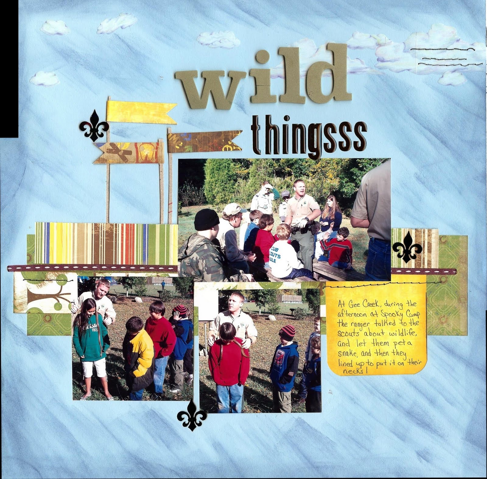
This may have been my favorite camping trip, no stress, no preparation on our part, we weren't in charge of anything, we just went and had fun. Because I really wanted to remember that on this layout, this needed a lot of journaling, and I had typed it up and tried to print it, but my printer was out of ink, and I had to have it finished before I could do another page, so I simply hand wrote it. I wanted the journaling to be the focus of the page, so I used the bright yellow pp that is in this collection, it really draws the eyes. The next place your eyes want to go is to the same yellow pp which was used for the word "Camp". These words on the left is a 'subway art' design from the online silhouette store. I made it taller for the design of the page, but did not make it wider, which gave it a little bit of a stretched out look. And then on the bottom, I used a Martha Stewart punch that didn't look too girly from the same yellow pp as I used for the word "Camp" and for the journalling, which leads the eye back to the large circle. For the large circular shape, I had to get a plate from the kitchen, but that wasn't quite as large as I wanted, but almost...so I used my largest Magic Matter to draw the circle that I cut out with the Fiskar's Fingertip knife on a glass cutting board. The layout still needed something. I'm in the mood for stripes lately, so even though the pagemaps sketch didn't have the strip at the top of the wide pp, I added it. It made it better, but there was still something I could do to make it better...I almost got out the sewing machine to stitch a zig zag around the circle, but decided instead to use my smallest Magic Matter to doodle around the circle and the elements on the page at the top.

Beautifall

Aren't these gorgeous papers? I've wanted this set by Basic Grey for about 2 years now, and Katrina, my sweet secret sister sent them to me this month. I was soo excited that I had to use them the very next layout I made! And the pictures from last year's photo shoot with my 2 kids and their 2 younger cousins was perfect, I still have so many pictures from that day I want to scrap. I used a May 2011 pagemaps sketch for the design, and pretty much followed it. for the large scalloped piece on the side, I used a scalloped circle shape on my silhouette and enlarged it and positioned it on the screen where it was mostly hanging off, but there was about 11 inches long and four inches wide left on the page itself, cut that image...and then I offset it 0.17", deleted the first scallop, and cut the larger scallop out of the yellow. Then to create the journaling scallop, I simply copied the scallop, made it smaller, and positioned it on the mat so that they would cut out at the same time. Then I deleted the large scalloped shape, offset the smaller by the same width (0.17) and cut the large patterned pp, but it faded into the other pp too much, so I offset that image also and then used some white cardstock to mat those, and I chose the font for the title (I saw it on a garden flag at Dollywood a couple of weeks ago and knew right away that I would be using "Beautifall" on a layout soon) and also made a rectangle the right size to mat the picture because it was so easy to do on the Silhouette, and cut those out at the same time. There wasn't any inking on this page, but I think the papers and the pictures just really shine.